
Introduction
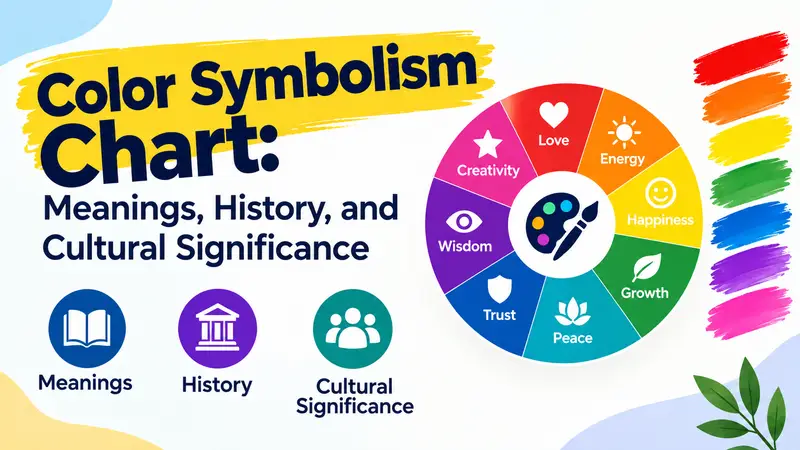
A color symbolism chart helps explain how people connect colors with emotions, ideas, traditions, and cultural values. Red may suggest love or danger, blue often communicates trust and calmness, and green can represent nature, growth, or money. These associations influence how Americans interpret clothing, advertisements, national flags, holiday decorations, artwork, and personal style.
Color meanings are not entirely universal. A color that represents celebration in one culture may be associated with mourning in another. Even within the United States, personal experiences, religious traditions, regional customs, and the surrounding design can change how a shade is understood.
Understanding color symbolism provides a practical way to interpret these visual messages. Whether you are choosing colors for a wedding, designing a room, selecting a tattoo, or simply wondering why certain colors create particular impressions, learning their common meanings can help you make more informed choices.
Quick Answer
A color symbolism chart commonly connects colors with emotions and ideas in modern American culture, such as red with love and urgency, blue with trust, green with nature and growth, and white with purity or peace. Historically, color meanings have developed through religion, political identity, traditions, natural associations, and cultural practices, so their interpretations can differ across communities.
TL;DR
- Red: Represents love, passion, danger, and urgency.
- Blue: Suggests trust, calmness, stability, and confidence.
- Green: Symbolizes nature, growth, renewal, and environmental awareness.
- White and black: Often communicate purity, mourning, elegance, authority, or formality.
- Yellow, orange, and pink: Commonly express optimism, warmth, creativity, affection, or playfulness.
- Cultural context: A color’s meaning changes according to traditions, personal experiences, and its surroundings.
What Is Color Symbolism?
Color symbolism is the practice of associating particular colors with ideas, emotions, identities, and social meanings. These associations can develop from the natural environment, religious beliefs, historical events, political movements, and everyday experiences.
For example, green is closely connected with plants and healthy landscapes, making it a natural choice for communicating environmental awareness. Red can signal danger because it is used on stop signs, warning labels, and emergency indicators. The same red can also represent romance when it appears on Valentine’s Day cards or a bouquet of roses.
Color symbolism works through both learned conventions and associations with familiar experiences. A color does not automatically produce the same emotion in everyone, but repeated exposure to particular combinations can influence how people interpret a message.
Color Symbolism Chart: Meanings of Common Colors
The following chart summarizes widely recognized associations in contemporary American culture. These are common interpretations, not fixed definitions that apply in every situation.
| Color | Common Symbolic Meanings | Emotional Associations | Common Uses |
|---|---|---|---|
| Red | Love, passion, danger, power | Excitement, urgency, intensity | Valentine’s Day, warning signs, promotions |
| Blue | Trust, peace, loyalty, stability | Calmness, confidence, security | Corporate branding, uniforms, bedrooms |
| Green | Nature, growth, money, renewal | Balance, freshness, hope | Environmental campaigns, gardens, finance |
| Yellow | Happiness, optimism, caution | Cheerfulness, alertness | Spring decorations, signs, playful designs |
| Orange | Creativity, warmth, enthusiasm | Energy, friendliness | Autumn décor, sports branding, advertising |
| Purple | Royalty, luxury, spirituality | Imagination, dignity, ambition | Fashion, ceremonial designs, premium products |
| Pink | Affection, tenderness, playfulness | Warmth, sweetness, care | Gifts, fashion, awareness campaigns |
| White | Purity, peace, simplicity, new beginnings | Cleanliness, openness, clarity | Weddings, healthcare, minimalist interiors |
| Black | Elegance, authority, grief, mystery | Seriousness, formality, restraint | Formal clothing, luxury branding, funerals |
| Gray | Neutrality, balance, practicality | Reserve, composure, restraint | Business attire, modern interiors |
| Brown | Earth, reliability, natural materials | Comfort, stability, warmth | Rustic décor, leather goods, packaging |
| Gold | Wealth, achievement, prestige | Celebration, success, distinction | Awards, jewelry, anniversaries |
| Silver | Modernity, sophistication, technology | Precision, coolness, refinement | Electronics, jewelry, formal décor |
| Turquoise | Water, freshness, communication | Relaxation, openness, vitality | Coastal design, accessories, wellness branding |
Red Symbolism: Love, Passion, and Warning
Red is one of the most attention-grabbing colors in everyday American life. It commonly represents romantic love, physical energy, courage, and strong emotions. Hearts, roses, and red decorations make it especially recognizable around Valentine’s Day.
However, red can communicate danger just as effectively as affection. Stop signs, emergency lights, and warning labels use red to demand attention or signal that a response is needed. In retail settings, red may emphasize a discount or encourage customers to notice a particular offer.
Its historical meanings extend beyond modern advertising. Red has appeared in political movements, military insignia, religious art, and symbols of authority. In the United States, its role in the national flag connects it with patriotic imagery, although the familiar meanings assigned to flag colors have developed through different historical interpretations.
When choosing red for a design, consider the surrounding message. A deep red can suggest sophistication or romance, while a bright red may feel urgent, energetic, or confrontational.
Blue Symbolism: Trust, Peace, and Stability
Blue is commonly associated with reliability, calmness, loyalty, and professionalism in American culture. Banks, technology companies, healthcare organizations, and other institutions often use blue in their branding because it can create a sense of order and dependability.
Its connection with the sky and water also helps explain its association with openness and tranquility. Pale blue is frequently used in bedrooms, bathrooms, and relaxing spaces, while darker shades such as navy often appear in business clothing and formal uniforms.
Blue has a distinctive role in American identity through the national flag and the country’s political symbolism. It is also closely associated with denim, which has become a familiar part of everyday American fashion.
Blue does not always communicate positive feelings. Expressions such as feeling blue connect it with sadness, while a cold or overly formal blue design may feel distant rather than welcoming.
The shade and setting matter. A light blue background can suggest freshness, whereas navy blue may communicate authority and tradition.
Green Symbolism: Nature, Growth, and Prosperity
Green is strongly connected with vegetation, fertile landscapes, springtime, and renewal. These natural associations make it a common choice for environmental organizations, gardening products, sustainable packaging, and campaigns promoting conservation.
In American culture, green also represents money. This connection is reinforced by the green coloring of U.S. paper currency, giving the color a recognizable financial meaning that extends into everyday expressions about wealth and business.
Green can also communicate permission or progress. Traffic signals use green to indicate that movement is allowed, while green check marks often indicate completion or approval in digital interfaces.
Its emotional associations depend on the shade. Soft sage can suggest calmness and understated elegance, while bright lime green may feel energetic and youthful. Dark forest green often evokes tradition, stability, and the outdoors.
Although green is frequently used positively, it can also represent jealousy or inexperience. These meanings demonstrate how one color can communicate different ideas depending on language and context.
Yellow Symbolism: Happiness, Optimism, and Caution
Yellow is associated with sunlight, warmth, brightness, and cheerfulness. In American design, it frequently appears in spring decorations, children’s products, playful branding, and spaces intended to feel welcoming.
Its visibility also makes it useful for communicating caution. Yellow traffic signals, warning labels, and construction signs can encourage people to pay attention without necessarily indicating the highest level of danger.
The color’s emotional effect depends partly on its intensity. A soft butter yellow may feel gentle and comfortable, while a saturated yellow can appear energetic or visually demanding.
Yellow is also associated with gold, sunlight, and abundance in some cultural and artistic traditions. However, it does not have one universally accepted meaning across historical periods or societies.
For home décor, yellow can brighten a room, particularly when paired with neutral colors. In graphic design, using it alongside black can create a strong visual contrast that helps important information stand out.
Orange Symbolism: Energy, Creativity, and Warmth
Orange combines associations commonly linked with red and yellow. It often suggests enthusiasm, friendliness, creativity, and movement, making it useful for brands that want to appear approachable and energetic.
In the United States, orange has a particularly visible seasonal role during autumn. Pumpkins, changing leaves, harvest displays, and Halloween decorations make it a familiar color from September through November.
Orange also appears in sports uniforms, safety equipment, promotional graphics, and outdoor products. Bright orange is easy to notice, while muted terracotta and burnt orange can create a more natural, rustic atmosphere.
The color can feel inviting when paired with warm neutrals or playful when combined with brighter shades. In large quantities, however, vivid orange may become visually overwhelming.
Orange is a useful choice when a design needs to communicate enthusiasm without the intensity or urgency that strong red can create.
Purple Symbolism: Royalty, Spirituality, and Imagination
Purple has longstanding associations with royalty, luxury, dignity, and religious imagery. Historically, some purple dyes were difficult and expensive to produce, helping certain shades become associated with wealth and status.
In modern American culture, purple can communicate creativity, individuality, and imagination. It is common in fashion, cosmetics, entertainment branding, and products intended to feel distinctive or premium.
Lighter shades such as lavender may suggest gentleness, relaxation, or romance. Darker purples can feel formal, dramatic, or luxurious.
Purple also appears in religious and ceremonial settings, although its meaning varies among traditions. In some Christian practices, purple is associated with penitence and particular seasons of the church calendar.
For personal style, purple can express originality without relying on extremely bright colors. Its associations with luxury and imagination make it versatile across both understated and expressive designs.
Pink Symbolism: Affection, Care, and Playfulness
Pink commonly represents affection, sweetness, tenderness, and romance in the United States. Its associations are particularly visible on Valentine’s Day, in gift packaging, and in designs intended to communicate warmth or care.
Pink has also become associated with breast cancer awareness through widely recognized pink ribbons and related campaigns. This use shows how a color can acquire a specific public meaning through sustained collective action.
Its connection with femininity is culturally influential, but it is not a universal or permanent rule. The association developed through changing fashion, marketing, clothing conventions, and social expectations.
Different shades communicate different impressions. Pale pink may feel delicate or soothing, while hot pink can suggest confidence, excitement, and bold self-expression.
Pink is also used in contemporary branding and fashion to challenge expectations about gender or combine softness with strength. Its interpretation depends on the design and the audience rather than on the color alone.
White Symbolism: Purity, Peace, and New Beginnings
White often represents cleanliness, simplicity, purity, and peace in American culture. White clothing, white flowers, and uncluttered interiors can communicate a sense of freshness or clarity.
One of its most familiar uses is the white wedding dress. Although white bridal clothing has a longer history, Queen Victoria’s highly publicized white wedding dress in 1840 helped popularize the style among later generations. The American association between white wedding clothing and purity became especially influential through changing social customs and fashion.
White also appears in healthcare settings, religious ceremonies, and symbols of peace. White doves, for example, are widely recognized as representations of peace and reconciliation.
Yet white does not always mean celebration. In several East Asian cultural traditions, white is associated with death and mourning, and white garments may be worn at funerals.
This contrast is a useful reminder that white symbolism is shaped by cultural practice. In the United States, its meaning often depends on whether the context is a wedding, a memorial, a medical environment, or a minimalist design.
Black Symbolism: Elegance, Authority, and Mourning
Black communicates formality, sophistication, seriousness, and authority in many American settings. Black suits and dresses are common choices for formal occasions, while luxury brands often use black packaging and typography to create a restrained, premium appearance.
Black also has an established role in mourning. Black clothing at funerals and memorial services is a familiar Western convention, although individual families and communities may follow different customs.
The color can communicate rebellion or danger as well. Black leather jackets, dark fashion, and certain musical subcultures use it to express independence, resistance, or an alternative identity.
In graphic design, black provides strong contrast and can make text easy to read when paired appropriately with lighter backgrounds. Excessive use, however, may make a design feel severe or heavy.
Black is not inherently negative. Its interpretation ranges from elegance and protection to grief and menace, depending on the objects, traditions, and messages surrounding it.
Gray, Brown, Gold, and Silver: Neutral and Metallic Meanings
Gray, brown, gold, and silver are often used to communicate qualities that differ from the emotional intensity associated with brighter colors.
Gray suggests neutrality, practicality, restraint, and professionalism. It appears frequently in business clothing, technology products, and contemporary interiors. Depending on its shade, it can also suggest sadness or emotional distance.
Brown is associated with earth, wood, leather, stability, and natural materials. In American design, it often appears in rustic homes, outdoor products, coffee packaging, and brands that want to convey craftsmanship or familiarity.
Gold commonly represents wealth, success, achievement, and celebration. Gold medals, trophies, wedding jewelry, and anniversary gifts reinforce its association with distinction and accomplishment.
Silver often communicates modernity, refinement, precision, and technology. It is common in electronics, jewelry, automotive design, and formal accessories.
These colors are especially useful when a design needs to communicate quality or restraint without relying on intense visual stimulation.
Color Symbolism in American Holidays and Traditions
American holidays provide some of the clearest examples of colors acquiring meaning through repeated public use.
Red, white, and blue are associated with national identity through the U.S. flag, Independence Day decorations, and many civic celebrations. The colors are familiar patriotic symbols, although their historical explanations are not always identical across different accounts.
During Christmas, red and green are prominent in decorations, wreaths, packaging, and seasonal clothing. Their popularity reflects a mixture of religious associations, natural imagery, commercial traditions, and established holiday customs.
Halloween features orange and black, largely through pumpkins, autumn imagery, darkness, and the holiday’s visual traditions. Valentine’s Day uses red and pink to communicate affection and romance.
Easter often features pastel colors that suggest spring, renewal, and new life. White flowers and clothing may also appear in weddings, religious observances, and other celebrations.
These conventions demonstrate that color symbolism is often learned through repeated experiences. The same color can carry a different message outside the holiday or ceremony that gives it meaning.
How Different Cultures Interpret Colors
Color meanings vary across cultures because societies develop their own customs, religious practices, visual traditions, and associations with everyday objects.
Red is an especially clear example. In the United States, it can represent romantic love, danger, and patriotic identity. In Chinese cultural contexts, red is widely associated with good fortune, celebration, and prosperity, including its prominent use during Lunar New Year festivities and weddings.
White commonly represents weddings, cleanliness, and peace in the United States. In some East Asian traditions, it is also strongly associated with mourning and funeral customs.
Green can suggest environmental responsibility in American advertising, while specific religious and national contexts elsewhere give it additional meanings. Purple, gold, and other colors also acquire different associations through local histories and institutions.
Indigenous color traditions deserve particular care. For example, Diné cultural traditions connect colors with sacred directions, mountains, and broader systems of meaning. These relationships cannot be accurately reduced to a generic chart of emotions.
A color chart is most useful when it introduces possibilities rather than claims that all people interpret colors identically.
The Psychology of Color: Do Colors Really Affect Emotions?
Research on color and emotion has found systematic associations between colors and emotional concepts. People often connect red with intensity, blue with calmness, yellow with happiness, and black with certain negative or serious emotions.
However, the evidence does not support a simple rule that a particular color produces the same psychological response in every person. Research involving participants from different countries has found both shared patterns and meaningful cultural differences.
The setting also matters. A red object in a romantic context may be interpreted differently from a red warning light. A blue bedroom may feel restful to one person but remind another of an unpleasant experience.
Brightness, saturation, surrounding colors, lighting, and personal memories can influence perception. A pale green wall, for example, may create a different impression from a highly saturated green advertisement.
Color psychology is therefore best understood as the study of tendencies and associations, not a guaranteed method for controlling behavior. Color can support a message, but it cannot determine how every viewer will feel.
How to Use a Color Symbolism Chart in Everyday Life
A color chart becomes practical when you begin with the message you want to communicate rather than selecting a color simply because it has a familiar symbolic meaning.
For home décor, consider the atmosphere you want to create. Soft blues and greens may suit a quiet room, while warm orange or yellow accents can make a shared living space feel more lively. Neutral colors can provide a flexible background for changing furniture and accessories.
For clothing, think about the occasion and your personal style. Navy may suit a professional environment, black can create a formal appearance, and brighter colors can make an outfit feel more expressive.
For weddings and gifts, consider the recipient’s preferences and cultural traditions. Red roses may communicate romance in a familiar American setting, while white flowers can be appropriate for celebrations or memorials depending on the community.
For branding and digital design, make sure colors also support readability and accessibility. Important information should not be communicated through color alone, since some users have color-vision deficiencies or view content under different lighting conditions.
The most effective choice combines symbolic meaning, practical function, visual harmony, and the expectations of the intended audience.
Common Misunderstandings About Color Symbolism
One common mistake is treating color meanings as universal rules. Although some associations appear across multiple cultures, others are specific to particular languages, traditions, or historical periods.
Another mistake is assuming that color alone determines personality. Someone who frequently wears black is not necessarily sad or rebellious, just as someone who prefers yellow is not automatically cheerful. Clothing choices can reflect convenience, professional expectations, fashion, and personal taste.
It is also misleading to claim that colors have identical effects on every person’s emotions. Color can influence perception, but its effects depend on context and individual experience.
Finally, popular charts sometimes present historical explanations as established facts without sufficient evidence. A familiar association may have developed gradually rather than originating from one event or ancient belief.
A responsible interpretation treats color meanings as useful cultural clues, not absolute definitions of people, objects, or situations.
FAQs
What is the most accurate color symbolism chart?
An accurate chart distinguishes common associations from meanings that depend on a specific culture or situation. It should explain that colors can communicate several ideas and that context often determines which meaning is most relevant.
Which colors symbolize positive emotions?
Blue, green, yellow, pink, and white are frequently associated with positive emotions in contemporary American settings. Blue may suggest calmness, green can represent renewal, and yellow often communicates optimism, although none of these associations applies universally.
What color symbolizes love?
Red is the most widely recognized color of romantic love in American culture, particularly on Valentine’s Day. Pink can express tenderness and affection, while white may suggest sincerity or a fresh beginning in some romantic contexts.
What colors symbolize peace and healing?
Blue and green are commonly associated with calmness, nature, and balance, while white can represent peace and simplicity. These meanings make them popular in wellness environments, but colors alone do not provide medical or psychological treatment.
Why does white symbolize purity in some cultures but mourning in others?
Color symbolism develops through local religious practices, social customs, and historical traditions. White’s association with purity is familiar in many Western settings, while some East Asian funeral traditions use white as a color of mourning.
Can colors have more than one symbolic meaning?
Yes. Red can represent romance, anger, danger, or celebration, depending on the setting. The objects, words, traditions, and other colors surrounding it help viewers understand the intended message.
How should I choose colors for a meaningful tattoo?
Start with the personal idea you want the tattoo to represent, then consider the color’s common associations and any cultural or religious significance. Your own experiences and the design’s context are more important than following a rigid color chart.
Conclusion
A color symbolism chart offers a useful starting point for understanding how colors communicate emotion, identity, tradition, and social meaning. Red can express affection or urgency, blue can suggest trust or calmness, green can represent nature and renewal, and black or white can communicate very different ideas depending on the setting.
The most important lesson is that color meanings are neither entirely universal nor completely arbitrary. They develop through a combination of human perception, cultural experience, historical traditions, and everyday use. Understanding those influences makes it easier to choose colors thoughtfully and interpret the visual messages encountered in American life.